
7 Tips for Better Email Templates
If you’re not thoroughly using email templates, you’re missing an opportunity.
Email templates just make sense. They save time, they boost quality from not having to reinvent the wheel, and they bring standardization.
There’s a trick, though; your templates must be designed properly. A good template boosts response rates to at least 2%, but a bad template can bury your message.
Here’s an example of a bad template:
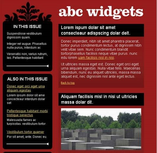
This template is content-heavy, plus the picture quality is bad. There is no call-to-action, and the font is illegible. Don’t prepare your templates like the one above.
Use these seven tips instead for email templates that actually work.
1) Responsive Templates
Always use responsive templates. The reason why responsive design is important is because not all viewers read from the same device. Some will see your email on a mobile device, some on a laptop and others on a tablet. A responsive design enables the browser to fit your email to the screen.
2) Minimal Word Use
Emails need to be short and crisp to gain a customer’s attention. Content-heavy emails can be a drag and easily find their way to the delete folder. Concise and unambiguous email copy is what your customers want, so make sure your template doesn’t encourage too much text.
When creating copy for an email template, consider these three questions:
Who is your audience?
What is the purpose of the email?
What is your CTA?
Once you have answered all these questions, stick to the basics and avoid unnecessary verbiage.
3) Savvy Image Use
A good responsive email template is the one that is not loaded with design (or pictures). Email templates should be simple and minimalistic. Too much of anything is never good, especially when it comes to the design. According to Dieter Rams, a very influential product designer, a good design is as little design as possible so the message stands out. In addition, some email clients may not support image viewing because of the load time or HTML issues.
So create an email template that has a subtle background and includes only a picture or two at most.
4) Clear CTA
Make sure your call-to-action (CTA) is not obscured or minimized by the design of your email template. The whole point of your email is the CTA, and if that is not clear then the point of email is lost.
Identify the CTA zones in your design so that it can be easily spotted. For better results, CTA buttons should be easy to reach and large enough to be clicked.
The best CTA zones are the left side of the screen or the sidebar, especially for mobile phone users where the CTA button should be within the thumb’s reach. The button should be large and of a color that catches the eye. Also, considering more users use mobile for viewing, ensure you are using single column page layout.

5) Simple and Large Fonts
The average distance we keep our laptop from our eyes is 12.5 inches (32 centimeters) and 13.3 inches (34 centimeters) for mobile phones. The screen size might vary, but the text should be visible in all the screens irrespective of the size.
The best way to handle this is to use large fonts. At the same time, legibility is improved by using simple fonts that are easy to distinguish. This will provide easy readability to the customers without losing their focus. To ensure optimal readability across devices, leverage Picsart’s font generator to create large, clear text that remains legible regardless of screen size, enhancing user experience and maintaining focus.
6) Quick Load Time
If your email takes too long to load, it doesn’t matter if you have a well-designed template. Good load time is essential.
Key to good load times is minimal use of images and embedded links, and smaller-sized attachments (or no attachments).
Test your email template before sending to check the load times by email tester. If possible, don’t include large files or images as it will eat up your load time for sure.
7) Other Aspects
Apart from these, the other aspects you can look into are usage of colors. Most of the times, colors have psychological influence plus there needs to be perfect harmony between bright and soft colors. In addition to this, be careful when including signatures and provide links only if required.
Even with these principles in mind, however, it still is a good idea to A/B test new templates before bringing them into service. Email templates is both a science and an art.
There are lots of good templates on the market, and also many that are horribly bad. So when selecting an email template, or designing one from scratch, keep these principles in mind.
No Comments