
Top 25 call to action examples to boost conversions
A good call to action (CTA) can be the difference between converting a new lead and losing them. There are many tactics that are employed to drive higher conversions in calls to action. Some of them are more powerful than others. Knowing the difference can help set you apart from the competition. Here we review the top 25 calls to action that are effective in improving conversion rates, which we hope will shed some light on the dos and the don’ts of CTA placement and formatting.
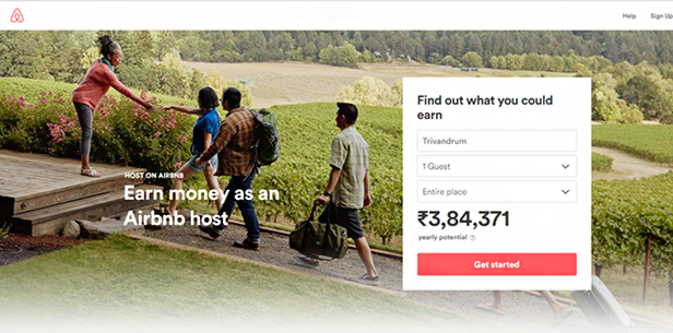 The copy that you place around your call to action can have a huge impact on its effectiveness. Airbnb does this nicely by reminding you that you can earn money by signing up. The promise of earning cash is an emotional trigger that works very well when done correctly.
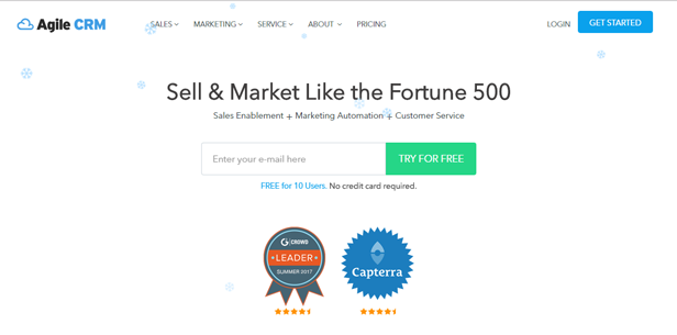
People love free stuff. Period. Many calls to action will include language in the CTA that indicates you will be receiving something for free by clicking through. Agile CRM nails it with this simple CTA that tells you exactly what will happen when you click.
Calls to action work well when there is no ambiguity around the button and where it will take you. Try to use copy on your button that indicates what will happen when you click. It’s much better than using generic words like “submit” or “go now.”
Placing your call to action in a web pop-up is an effective way to increase conversions. When you land on a page, a pop-up appears that dominates the entire page, persuasively calling your attention to the action at hand.
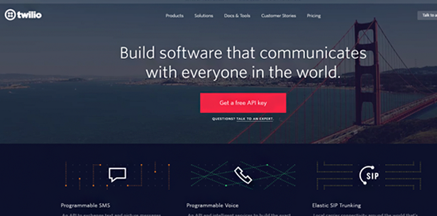
Again, when you use text on your button that leaves no doubt as to what clicking will do, you increase conversions from visitors that might otherwise leave your page in confusion. In this case, “Get a free API key” is very specific, and will certainly convert leads who came to the site for an API key.
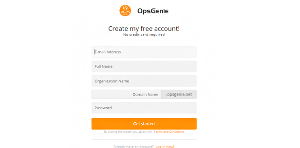
It’s very effective to use first-person voice in your CTA. Tell the reader what they will be doing by clicking. Use words like “my” and “our” in your CTA to let visitors envision what will happen to them when they click.
If you are offering any kind of assistance with your call to action, say so on the button. Believing that clicking the CTA will help you is an emotional response that works well. Anyone looking for help will more than likely feel compelled to click through by that emotional trigger.
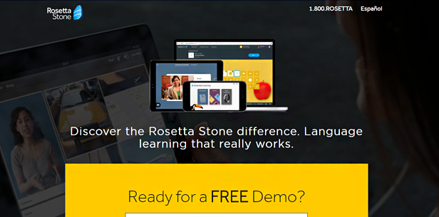
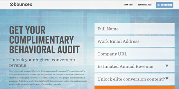
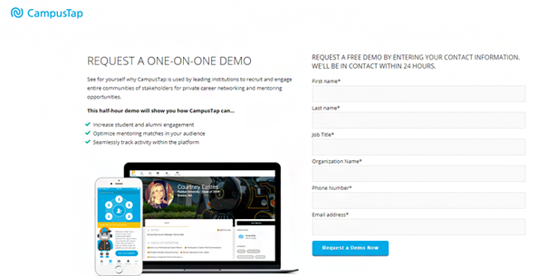
Free demos are a great thing to offer with your call to action, particularly if you offer software as a service. Anyone considering the service will likely want to try it out first, so offering a free demo, and saying so on your CTA button, will increase conversions.
Again, the first-person voice can be very effective in increasing conversions in your call to action. When it sounds collaborative, between the visitor and the company offering the product or service, it helps visitors feel like the company will value their input, and will be there to help them along the way.
When you ensure that the call to action is the only clickable link on the page—with the exception of a link to return to your homepage—you increase the probability or a conversion, simply from the fact that leads won’t be distracted by the option to click other links.
It’s important to position your call to action correctly on the page. English speakers read from left to right, and from top to bottom. Placing the call to action in the bottom right of your page is a tried and true tactic for increasing conversions.
Be sure to use a color that stands out for your call to action button. If it’s hard to see amidst the rest of the activity on the page, visitors will be less likely to click and convert. Use a color that contrasts well with the surrounding page’s color scheme and you’ll increase your conversion rates, without a doubt.
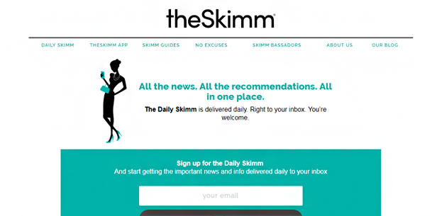
When considering what copy to put on your button, be sure to keep it concise. Buttons that have five or more words tend to see lower conversion rates. Keep it simple and make it impactful for increased conversions.
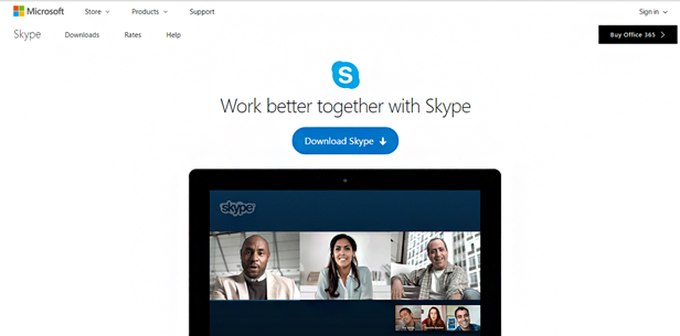
Put arrows or other shapes on your call to action button to help drive home the urgency around clicking through. This is particularly important if your call to action is offering a download, as the downward-facing arrow is the universally understood icon for a download.
Provide visitors to your site with the potential to be included in something. In this case, “I’m in” conveys a sense of inclusion that humans naturally—if subconsciously—look for in daily life. And calls to action are no different in this sense.
Use copy on your call to action button that strikes an emotional chord with the viewer. If you’ve been looking for a vehicle for a long time, and a CTA button promises to help find your vehicle, it will resonate with you much more than if the button said “submit.”
A sense of urgency is an important thing to include on your call to action. Words like “now” and “today” convey such a sense of urgency and are likely to increase the conversion rate of your calls to action.
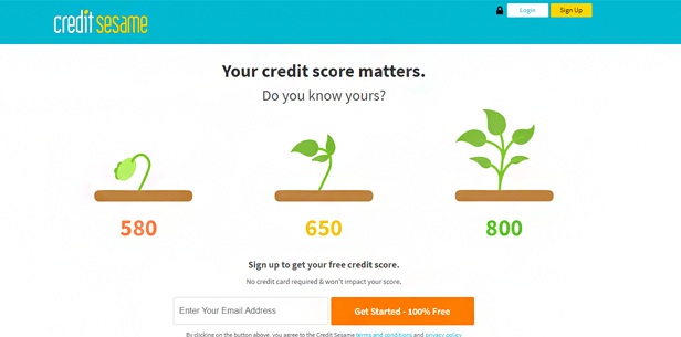
Again, conveying that what you are offering is free is a great way to increase conversions. If that’s the case, always try to make a point to include the word “free” in the copy you use on your button, leaving no confusion about the fact that it is free.
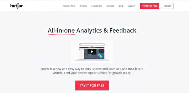
Here is another great example of the use of a contrasting color to help a button stand out. It needs to be a color that jumps out at you, as is the case with red on white in this example from Hotjar.
We mentioned this above, but it’s worth reiterating. Be as clear as possible with the copy on your CTA button and be sure it tells visitors exactly what lives behind the button. It cuts down on uncertainty, which is a huge hinderance to conversion.
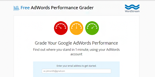
People are competitive by nature, and they love to see where they stand against the competition. If you are offering an assessment of any sort, like this example from WordStream, be sure to indicate that on the button and you will increase conversions.
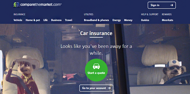
This is perhaps the best example of using a contrasting color to help your button stand out. When looking at the page, it’s hard to not let your eye gravitate to the green button. It stands out so well, that the rest of the page becomes a secondary consideration.
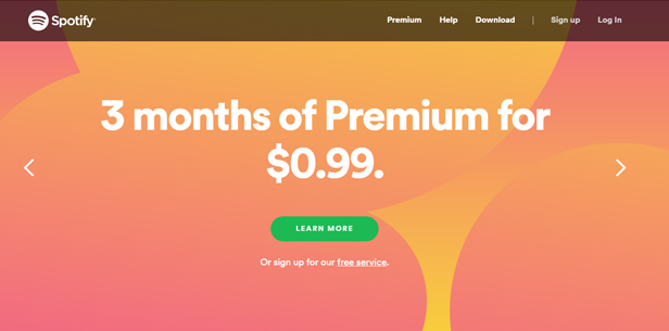
If you are offering any kind of discount, be sure to say so in the copy you place on your call to action button. People love discounts almost as much as they love free stuff, so tap into that emotional trigger and display your discount front and center.
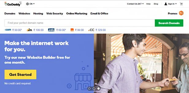
Placing two calls to action on the same page can be tricky, but if you decide to do so, be sure that both of them are simple and straightforward, and make sense being beside one another. GoDaddy shows us how to place two CTAs on the same page in an effective manner that will ensure both are able to convert leads.
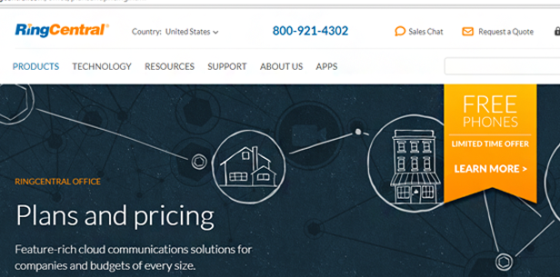
By showing a comparison of services, in a hierarchical order, you increase conversions by giving visitors an option to choose from. In this case, it doesn’t matter which CTA a visitor clicks, it means the same thing: a new converted lead who is one step closer to signing up for RingCentral’s service.
No Comments