
Five Examples of Good Exit Intent Pop-ups in Action
Exit intent pop-ups actually work.
Even if you are someone who doesn’t like pop-ups generally, you probably will agree that exit intent pop-ups or overlays are worthwhile if personalized properly. In addition to this, it also increases your conversion rate to up to 25 percent.
That’s the reason why more and more websites are opting for exit intent pop-ups. Similarly, marketers are focused on grabbing the visitor’s attention by re-engaging him or her with something less complicated and more action oriented. This is helpful as there is now an understanding that not all visitors who abandon your site will return. Instead, they help them stay using pop-ups that will allow them to leave their information, or direct them to another page or offer them a content piece.
However, your exit intent pop-ups are hugely dependent on what you are offering to your customers. If it is not done correctly, then the chances are high that it won’t work the way it should.
Let’s look at the five best examples of good exit intent pop-ups in action:
1. Get Conversion the Second Time
You were already providing your visitor with a side-bar pop-up, but you still did not get a conversion. Well, use your exit intent pop-up wisely; go for the bigger and bolder design plus text like this example from QuickSprout:
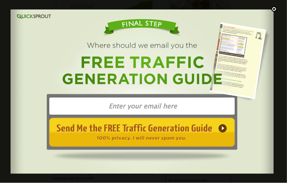
The intention is very clear from this pop-up – get the visitor’s email details using a free guide. It is clear QuickSprout is only interested in capturing the email subscribers, which they couldn’t do while the visitor was on the website. By providing a very useful content upgrade, it is a sure shot that they will get many signup conversions. Ensure that you use your second chance for conversion very seriously and provide something of value to your users to get successful conversions.
2. Alter Customer Decisions Through Choices
Grab your visitor’s attention again by providing them with a simple, yet compelling choice. Look at this OptiMonk pop-up:
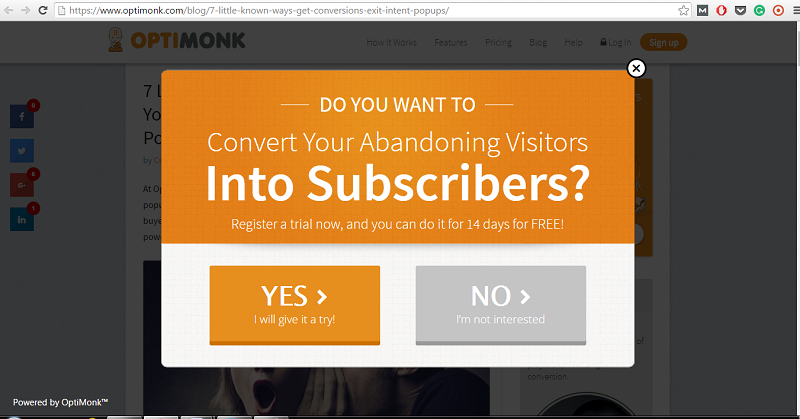
The message is clear and simple, plus it is giving the visitors only two choices: yes or no. By simplifying the choices for the visitors, you will make it easier for them to make a decision. The added advantage in this pop-up is that it is very clearly asking you to register for a free trial and then make a decision whether you want to purchase the product or not. This pushes the visitor’s mindset to change and try out the free version. Because, well, everyone loves to try new things if they are for free. For the “No” opt-out you can also add text like “No, I would rather not receive free deals via email.” This will push the visitor to reconsider the “No” option and signup for emails.
[bctt tweet=”Look at some of best examples of exit intent pop-ups and see how they can be useful for your site.” username=”agilecrm”]
3. Offer Other Product Recommendations
Cross-selling and upselling can be good tactics to make your visitors change their buying decision. It may happen that the product that the buyer wants to buy might not be on the landing page. Odds are there are too many choices. So, you cross-sell or upsell like Diamond Candles:
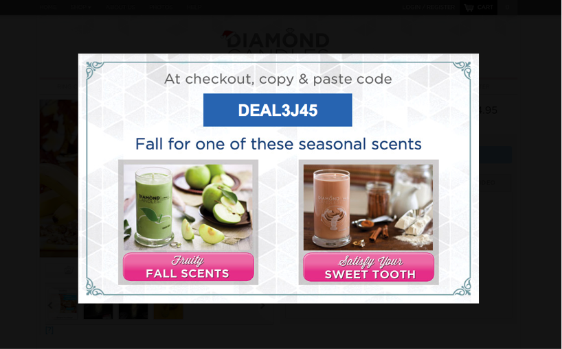
Use a personal connection with the visitor and offer them something they can’t resist. At the same time, keep the choices simple and minimum. Diamond Candles is trying to do exactly that. It is offering something seasonal to its visitors and also attaching a discount with it. This obviously increases the conversion rate, because the visitor will convert as the product choices are good, plus they get a discount.
4. Grow Your Subscribers List
Asking your visitors to subscribe to new offers and a newsletter can be an easy way to increase your email subscription list. However, use fun, interactive content to get your visitor’s attention. As you know, your readers are loyal and would like to get new, fresh content in their mailbox and that’s what GQ is doing here:
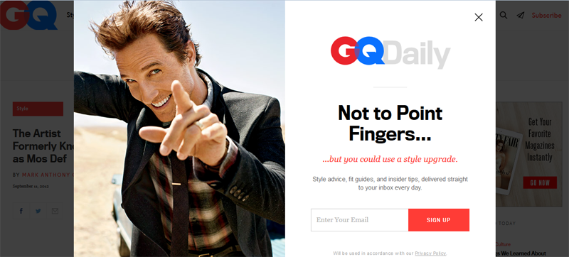
This exit pop-up is so much fun, persuasive and humorous. Obviously, it is offering something value-added to its readers. Who wouldn’t like to know the new style trends and tips to better their fashion sense? Exclusive tips, new trends and cheat sheets work really well as offerings when you are trying to make your readers and visitors signup.
5. Reduce Shopping Cart Abandonment
Shopping cart abandonment happens way too often. The only way to reduce this is by using an exit overlay that offers discounts or coupon codes. The BeHappy site did it this way:
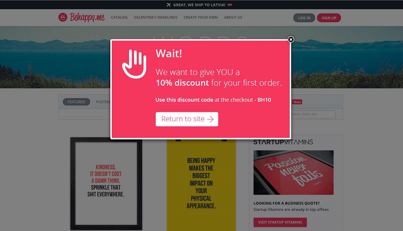
The messaging, layout and design is so correct and to the point. Nothing is over done here and it presents the action in the simplest way possible: Don’t abandon your cart; instead, take a 10 percent discount. Exit pop-ups like this during cart abandonment work wonders and can increase your conversion rate to up to 10 to 13 percent.
Hopefully, you are able to see the value of the exit intent pop-up by now. Such pop-ups are your second chance. All you need to do is use it to its optimum. Think about your visitors and your criteria, then create a pop-up that will definitely convert. Ensure that you offer your visitors something which will make them realize that they can’t say no. You can even make the opt-out so value-added that they change their minds.
2 Comments
exit intent
about 8 years agoGreat! Thank you for sharing :)
ReplyGabriel Swain
about 8 years agoThanks for the comment and the encouraging feedback! We appreciate it very much. Keep reading for more best practices and emerging trends. Cheers!
Reply