30 best landing page examples that convert leads
A strong landing page is the cornerstone of effective lead generation. But there’s a lot of pressure, to be sure. You get one chance to wow your audience and convince them to engage with you. If your page doesn’t cut it, you’ll lose them, perhaps for good. It doesn’t matter if you create it on WordPress using a landing page generator, or use landing page templates in your marketing automation solution. The same rules still apply. Check out these landing page examples and learn some clever ideas that you can implement on your own to increase conversions.
1. ClickDesk
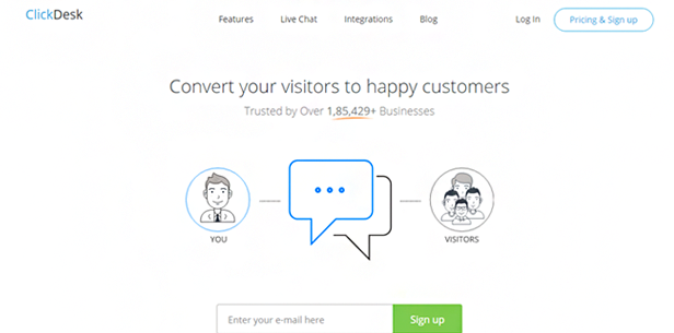
Including a method of contact on your landing page lends you credibility and legitimacy, as it indicates that you are real and available. Live chat is a great way to do that and ClickDesk accomplishes it well. The page has a very clean, minimal design full of white space, which allows the blue chat box to jump out at you—it’s hard to miss.
2. Xero
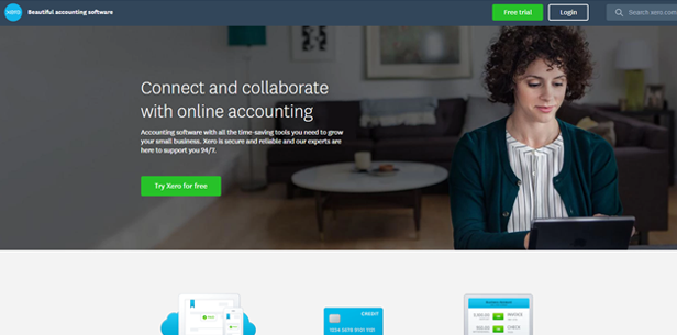
Xero wins the prize for the best flow on a landing page. The flow follows a logical progression, with high-level benefit icons at the top, followed by more in-depth benefits, price plans, and finally customer success stories. It has all the right ingredients to tell a story, which is great for increasing conversions. And don’t forget, long-form landing pages can be very effective if the flow is executed properly, so don’t feel hemmed in by page length.
3. Uber
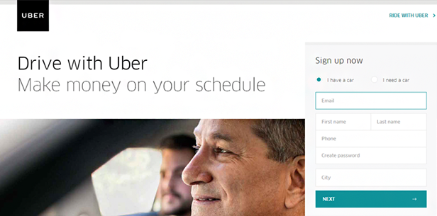
Uber has significant name recognition. It is well-known as a great way to earn money on the side, so we can assume that anyone landing on this page is looking to do just that and is likely already familiar with the company. This is why the page seems so bare—they don’t need to explain anything else because the assumption is that the audience already knows. Context is everything; knowing your audience and speaking to them accordingly is critically important.
4. Skype
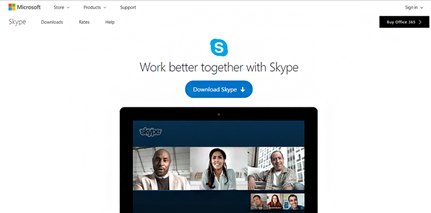
White space on a page is an excellent tactic as it helps direct the eye to what’s important and doesn’t risk distracting the reader’s attention. Skype has done this particularly well—the white space directs the eye of the reader directly to the CTA, while the contrasting blue of the Download button leaves little doubt about the actions you must take. It’s minimal but effective.
5. Webroot
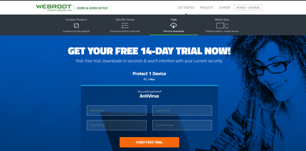
When creating an effective landing page, you want to relay as much information as possible with a minimal number or words. Bullets are a great way to do this—particularly concise, one-line bullets such as Webroot includes on their free trial page. The reader can skim the bullets and, in a few seconds, know everything they need to know about the product. Attention spans are short these days, so say as much as you can, as briefly as possible.
6. Crazy Egg
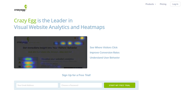
If you can manage to illustrate to a potential buyer what your product does—at a high level—in one screenshot, you’re doing well. The image here makes me want to buy the product without even reading about it. I see it and I think: I would love to see which links on my site are getting the most traffic—particularly in this view. The product or service itself can indeed be your landing page inspiration. A picture is worth a thousand words… no, really.
7. Green Chef
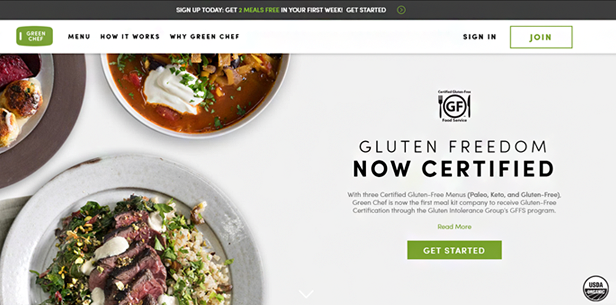
Including product certifications on a landing page can establish trust and positions the offering company as reliable. The gluten-free certification, in this case, takes up little space on the page but conveys to anyone who needs a gluten-free diet that this service is safe for them to consume. Don’t underestimate the impact that a small difference like this can make to your conversion rate—if your product or service is certified, brag about it.
8. Headspace
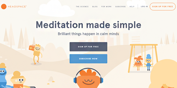
Many people have the perception that meditation is challenging and difficult. The simplicity of this page’s design relays the message that it is not, and presents meditation as something approachable. By addressing this understood mental hurdle via the page design—not to mention the headline—Headspace addresses this concern before it arises (again, context is everything).
9. Evernote
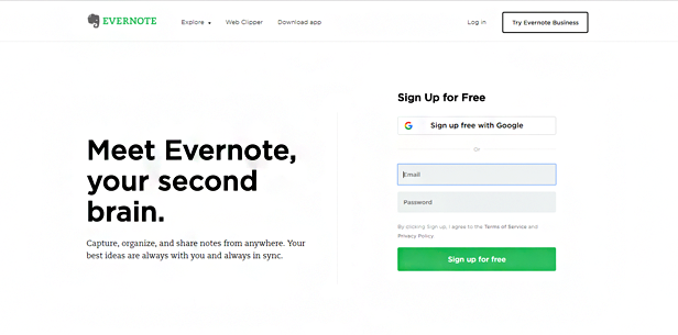
An awesome headline is worth its weight in gold. If it makes you think, it’s on the right track. Evernote’s headline, “Meet Evernote, your second brain,” definitely sparks curiosity. Think of it as a hook meant to draw people in—once they are hooked, it’s much harder for them to look away. Its catchy copy makes it one of the best landing pages reviewed here.
10. Integrate
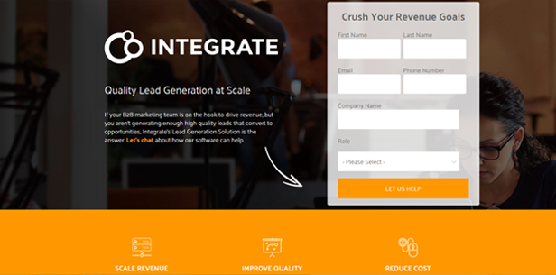
Formatting your landing page with evenly proportioned sections is important. Notice how the three icons at the bottom of this page break it up into thirds. Now notice that the form is lined up on top of one of them, maintaining this formatting. Important tip: break your page up into halves or thirds and stick to that.
11. YogaGlo

Emotional triggers are very important, and this page’s hero image definitely triggers an emotional response from those looking to try practising yoga at home. Very concise text allows the photo to take most of the page’s real estate, which in this case is significant as the emotional trigger is more important than explaining what yoga is.
12. Spotify
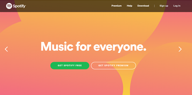
Spotify has blown up over the last few years, so anyone navigating there likely already knows that it is a music streaming service. The header is simple and clear. The green button stands out well because of the contrasting color. And with an option to open a free account, the page is well-built for conversion.
13. Rosetta Stone

Offering a free demo is a great way to hook people and maintain a high conversion rate on your landing page. This page provides a brief summary of the service and allows the reader to view a demo in exchange for nothing more than an email address.
14. Credit Sesame
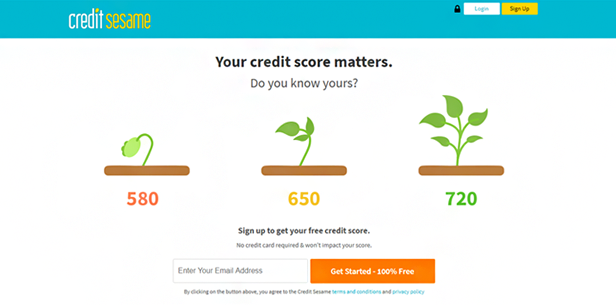
Credit Sesame gets right down to brass tacks with an emotional trigger—in this case, your potential concern about a low credit score. The reader immediately hopes their credit score is not the equivalent of a dying plant and is likely to offer a simple email address in exchange for the peace of mind that comes with learning where they stand. The tactic is simple: illuminate a fear or pain point, then offer the solution.
15. Geico
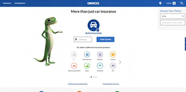
First impressions and trust are key to increasing conversions. Geico takes the pain out of the insurance quote process with an easy-to-digest page that provides quotes for all types of insurance in one place. Offering painless quotes establishes trust (they don’t ask for any personal information), which is a great first impression and one that is likely to result in the reader digging further. It’s about engagement, plain and simple.
16. Airbnb
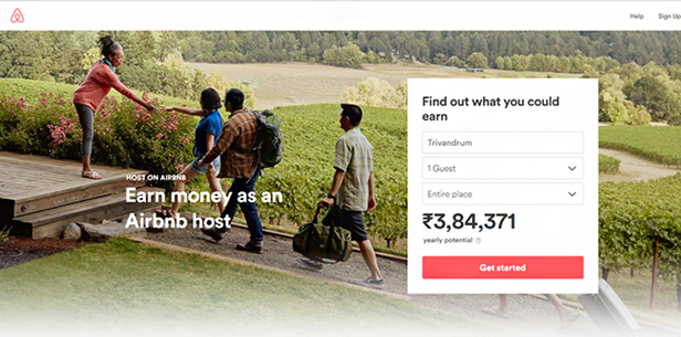
The imagery on this page is awesome, and so is the fact that Airbnb provides an estimate of how much you could earn in your area for your type of rental property. Engaging the reader before they even take action is a great tactic for boosting conversions.
17. InsureMyTrip
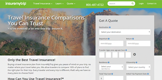
You can ask a lot of questions on your form, as long as they do not all solicit personal information. This page gets straight to the point with its copy, and the form is not at all intimidating, meaning people are more likely to submit it, even though it is long.
18. PayPal
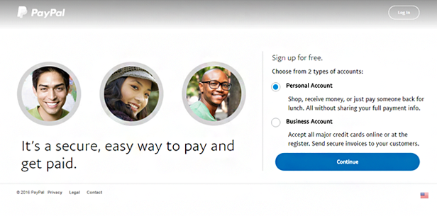
Don’t give them too exits from your page. The fact that there is no navigation across the top of the page means that the reader is not tempted to click to another page, and is more likely to sign up. In this way, you can dictate their journey through your site.
19. Plated
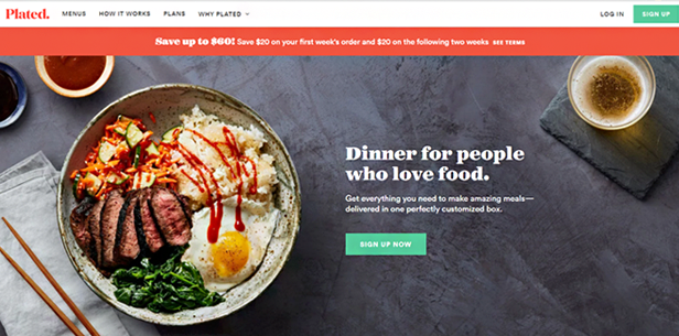
If you’re looking for a meal delivery service, seeing a photo of deliciously tempting food on the landing page might make you start salivating. Again, it’s that emotional trigger that works so well. The four icons below relay lots of information with little text. And the 50% discount at the top is icing on the proverbial cake.
20. Redfin
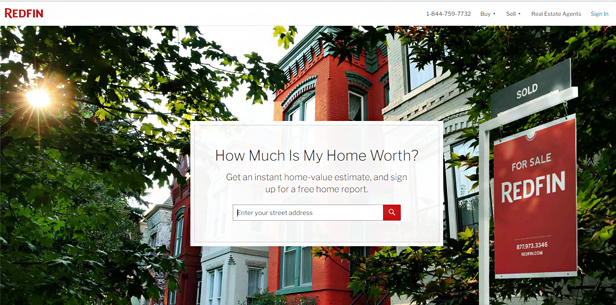
Redfin pulls you in incrementally. Once you enter an address, you are returned a basic home-value estimate and offered a more detailed estimate in exchange for your name and email address. It’s another hook: once you’re already engaged with the site, your much more likely to request the detailed estimate.
21. 23andMe
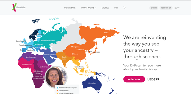
If you’re looking to learn about the geographical distribution of your DNA, 23andMe’s landing page is likely to pull you in. The distribution map they display piques your interest, while the image of the woman allows you to imagine yourself in her shoes, learning where your lineage is from. This is an example of exceptional landing page imagery.
22. World Vision
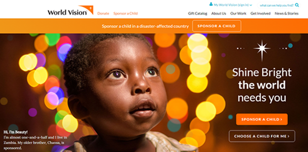
It’s always best to inspire with your emotional trigger, and nonprofits are true champions of this. The image of the child—unlike images on the sites of many charities focused on helping children—is inspirational, not heartbreaking. People are more likely to engage if they are inspired than if they are deflated.
23. Hired
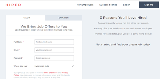
If you’re looking for a job, you probably won’t be overly influenced by attractive imagery. It’s a matter-of-fact search. Alternatively, a sign-up page that gets straight to the point and lists high-level benefits is more likely to grab your attention—you really don’t need to know anything except for how it works and how to sign up. This is why knowing your audience is so important for landing page conversion.
24. Chevrolet
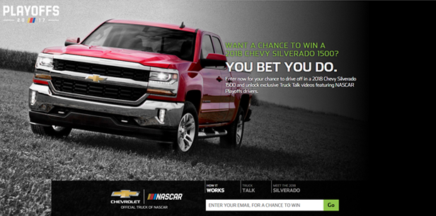
Sweepstakes are a great way to convert anonymous visitors into known leads. People love a chance to win a prize and will often share an email address with you in exchange for the chance to win. It can even be a small prize because the motivation to play is as much about the excitement of winning as it is about the actual prize. It’s a clever way to create effective landing pages for lead capture.
25. Mixcloud
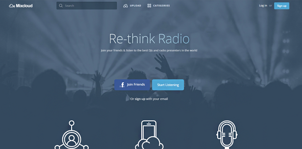
An important part of landing page design is a persuasive subheadline. Mixcloud accomplishes this nicely with the subheadline: Join friends & listen to the best DJs and radio presenters in the world. While that is a hefty promise, it was powerful enough to convince me to sign up, which only requires an email address.
26. GoToWebinar
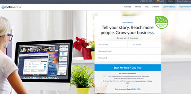
If you’re looking for a webinar tool, you’re likely to come across GoToWebinar. Their landing page offers a free trial, which is a great way to boost conversions. It also offers a discount which is likely to generate even more conversions. The message here: you can try it for free and if you like it you’ll get a discount, so what have you got to lose?
27. Swagbucks
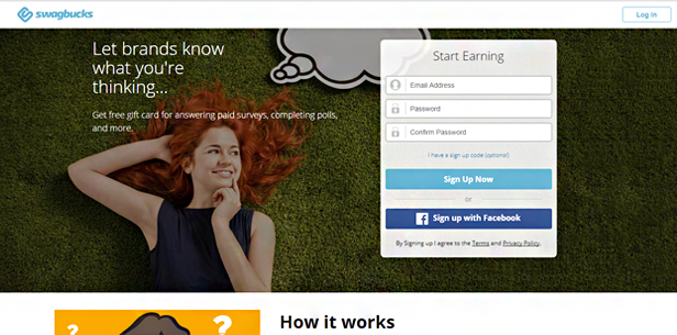
Never underestimate the importance of the copy you place on your form. For someone looking to make some extra cash on the side, the copy on the form (“Start Earning”) is a powerful emotional trigger likely to push you over to register.
28. European Congress of Psychology
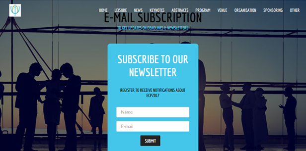
If you have a newsletter, be sure to make it easy to sign up and receive it. Don’t ask for more information than necessary—typically this would be an email address only, or email and name. Once you have the name and email in your database, you can continue to market to them. Once you engage them further and have a familiar relationship with them, you can ask for more information and they will probably be glad to offer it.
29. Peace Corps
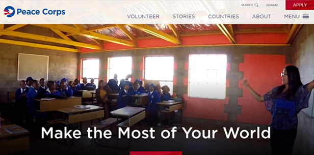
Young people in the USA who graduate college and want to engage in altruistic work often consider the Peace Corps. The image of the woman teaching a class is intended to inspire those young people, who imagine themselves in her shows, aiding a small village in a developing country. This is emotional triggering at its best.
30. Squarespace
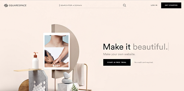
Squarespace wins the award for the most informative landing page with fewer than 15 words (excluding the button and top navigation). Their headline and subheadline tell you everything you need to know: you can use this service to build your own website. The button is very well done as well; instead of placing generic text on your button—such as “submit”—personalize it to reflect the action taken.
1 Comment
Dartan
about 8 years agoWhat I often do for more inspiration is go to Pinterest, it always has at least several good ideas you can try and adapt to your own designs. For example, https://www.pinterest.com/lanc07/landing-page-web-design-inspiration/ Also, what's important to note, many of the examples listed are from super successful companies like Spotify, Uber and so on - they can afford to spend thousands on designs and then A/B testing them to choose the best. I really like MailerLite's idea to include landing pages created by the clients (sure there are some landing pages created by professionals) but there are also some super simple pages that can be created with very little time and knowledge https://www.mailerlite.com/landing-page-examples
Reply